 Churn Dash almost flimsy
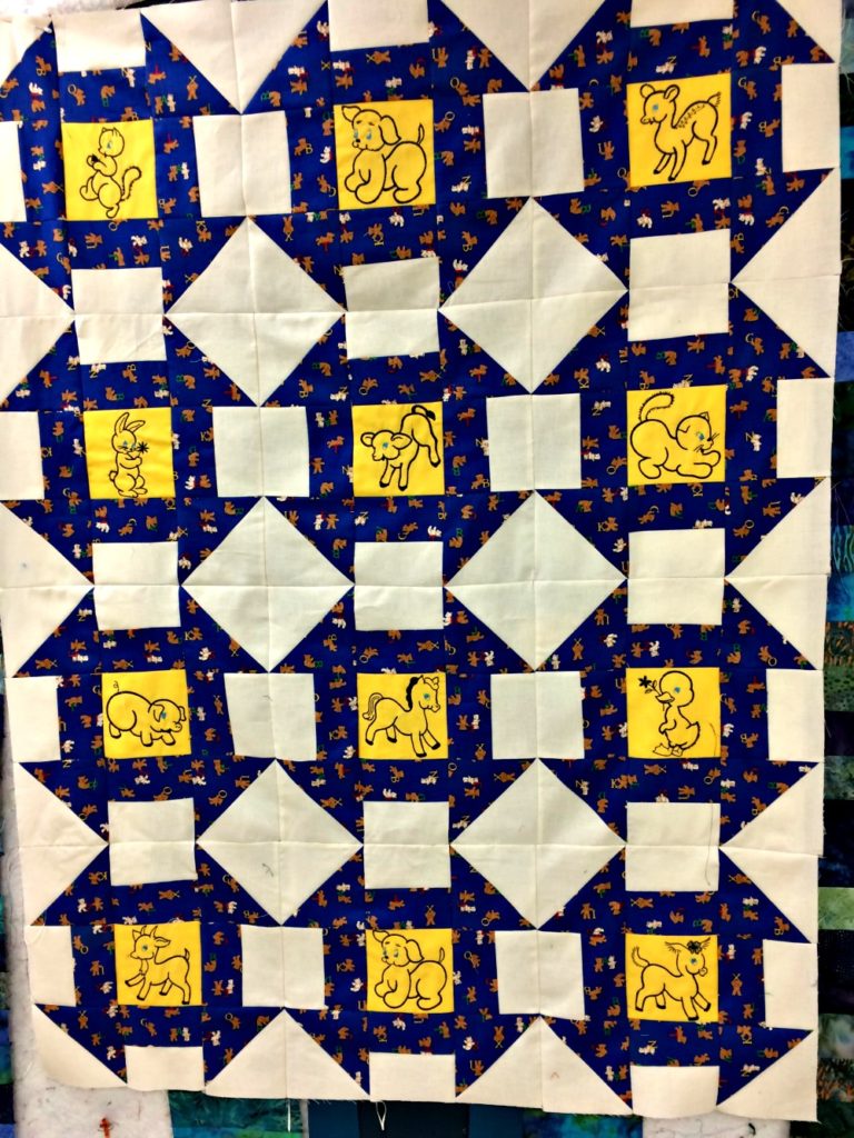
OK, I am in trouble this time. I didn’t map this out and didn’t realize how much white there would be. And I didn’t calculate yardage so I am out of the dark blue with the little bears. But I did have enough with small scraps left. So I think I will just use a plain dark blue to match the dark blue in the quilt as a border. But what am I going to do with all that white space? I need suggestions here. There are 15 squares and 6 big diamonds.
Weekly yardage report for 2/17/17:
Used this Week: Feb 10 5.875 yards
Used this Month (Feb) 10.875 yards
Used year to Date 36.875 yards
Is the problem with the white spaces a quilting problem, or keeping the quilt clean?
I like the idea of a plain dark blue border. I’m glad that you managed to get all your churn dash pieces cut out!
If you want to minimize the white, is it possible to cover the white areas up with another color that coordinates with the rest of the quilt? It might not be necessary to cover the white up completely, though. Maybe you could put a smaller square on the larger white squares so that there would be a white border around the smaller square.
Sharon, since you have been the one making the top, you are more aware of the white space. When I look at it, the yellow squares pop first and then the blue. If you google images for churn dash quilts, others have had the same color blocking effect. I don’t think it will be analyzed that closely by someone who receives the quilt. See others with large amounts of white: http://cluckclucksew.com/2013/10/churn-dash-block-tutorial.html http://sotakhandmade.blogspot.com/2012/11/churn-dash-quilt-finished.html Also, to detract from the white, I might add a very narrow border of yellow and then a dark blue. I think then the eye will travel from the yellow and blue in the center to the yellow and blue in the borders.
On the white spaces they really pop on the quilt, but if you are worried about them getting dirty, you might applique something on top of them.
The plain blue will look fine! In the white spaces: hearts? A different design in each triangle? It’s a good opportunity!